 I thought I'd use this cute little image from the "What A Character" kit from Paper Garden Projects to share a little more of what I learned in my Copic Certification class. I did a little experimentation here.
I stamped the image in Memento Tuxedo ink (I love the Memento for use with Copics). Then I colored and shaded just the dress. (for shading, I imagined the sun in the upper left - so I added darker color along the right side and a little at the bottom.
Here is the experiment - I wanted the dress to have some texture, so I added the colorless blender solution to a clean terrycloth rag and dabbed it on the dress. (this was a technique we learned in class). Now, this adds quite a bit of blender solution to your picture - so you need to make sure the stamping ink is very dry. I was impatient and did this when my coloring was probably still damp. You get crisper impressions if the base Copic ink is dry. This can be tricky - too much solution and the ink will flow outside the image lines lines (like the right edge of my dress). Also, you need to color the areas of texture first, do the texture, let it dry and then color the rest. Otherwise the blender solution could make all your colors run together.
This is a little tricky and I need more practice, but some of the sample effects I saw were awesome.
Another thing on this picture, I wanted the shoes to have a little shiny highlight, so I colored them solid, let them dry and then used the blender pen to remove the color on the "sunny" side of the shoes.
This looks OK - but the saying is a little flat.
 So, I went around the inside of the outer edge of the voice balloon with B-60 (pale blue Grey). You can see that here.
 To soften it, I took the colorless blender pen and blended in small circles from the colored edge to towards the center. This is one thing the blender pen does very well, blending color to white. I like this softer look better.
I also used the B-60 to create shadows below and to the right of my image (because my "imaginary sun" was in the upper left).
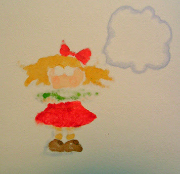 I just want to quick show you the backside of the image. This is 80lb weight cardstock and you can see the color bleeds right through. (this is why I have to keep reminding myself not to color the inside of cards!).
If you are having a hard time getting a smooth layer of color when you are coloring large areas, try looking at the back of your work. The color should bleed through the back pretty evenly. If its not, try coloring in small circles and giving the pen just a wee bit more time to saturate the paper with ink. You need to color slow enough to saturate the paper, but fast enough to keep a wet front edge.
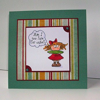 Here is my simple card. (Sorry - had to take the picture with a flash - the sun went down, and way before I was ready!).
One last thing, when I colored the plate, I used a green that was just a little too bright to blend with the paper in the card kit. So I simply colored over the plate with a layer of cool gray #1 (C-1). This is a great way to tone down colors and I'm learning to use it more and more. I need more grays! (markers - not hairs, got plenty of those).
Well, if you hung in this far you deserve a prize! But I don't have one..........
One quick question, to my regular readers (yes, all 5 of you). I usually don't note the Copic colors I use because..... I didn't think anyone would care..... So do you care??
Thanks for stopping by. Tomorrow is Garden Party day and I think I like what I came up with this week.


7 comments:
It is nice to have the colors you use as a reference for those of us who are buying them a few at a time. That way we know more what a certain color might go with.
Cute card and I'm so in awe of all you do!
Fantastic pointers. That Copic class must have been awesome. Thanks for sharing what you learned. :0)
toooo cute! I always appreciate when the color numbers are given or a picture of the markers used are shown.
Catherine, I'm a regular reader, so that makes 6!
I just don't comment much, lol. I do look at your blog regularly and love the cards you do.
I don't have Copics (Prisma markers instead) so the color numbers don't matter to me. But I love that you are sharing your coloring techniques.
I loved your Copic coloring pointers....and I'd love to know the colors that you use. I have some Copic markers and want more!
I also liked your idea for toning down a too bright color...it works beautifully! Thank You!
I, too, am a Prismacolor marker gal, so the color references don't matter to me BUT I really like your techniques. I am going to try that texture technique with my colorless blender and my Prismas. I can't wait to see more of your posts! Oh, and I'm a regular viewer, but not a regular commenter. Rock on!!
thanks for the great coloring tips!
Post a Comment